

Messages (Statistics)
This report provides detailed information about the volume of messages sent and received in your channel, allowing you to monitor activity and user engagement over time.
- In your channel, go to Statistics.
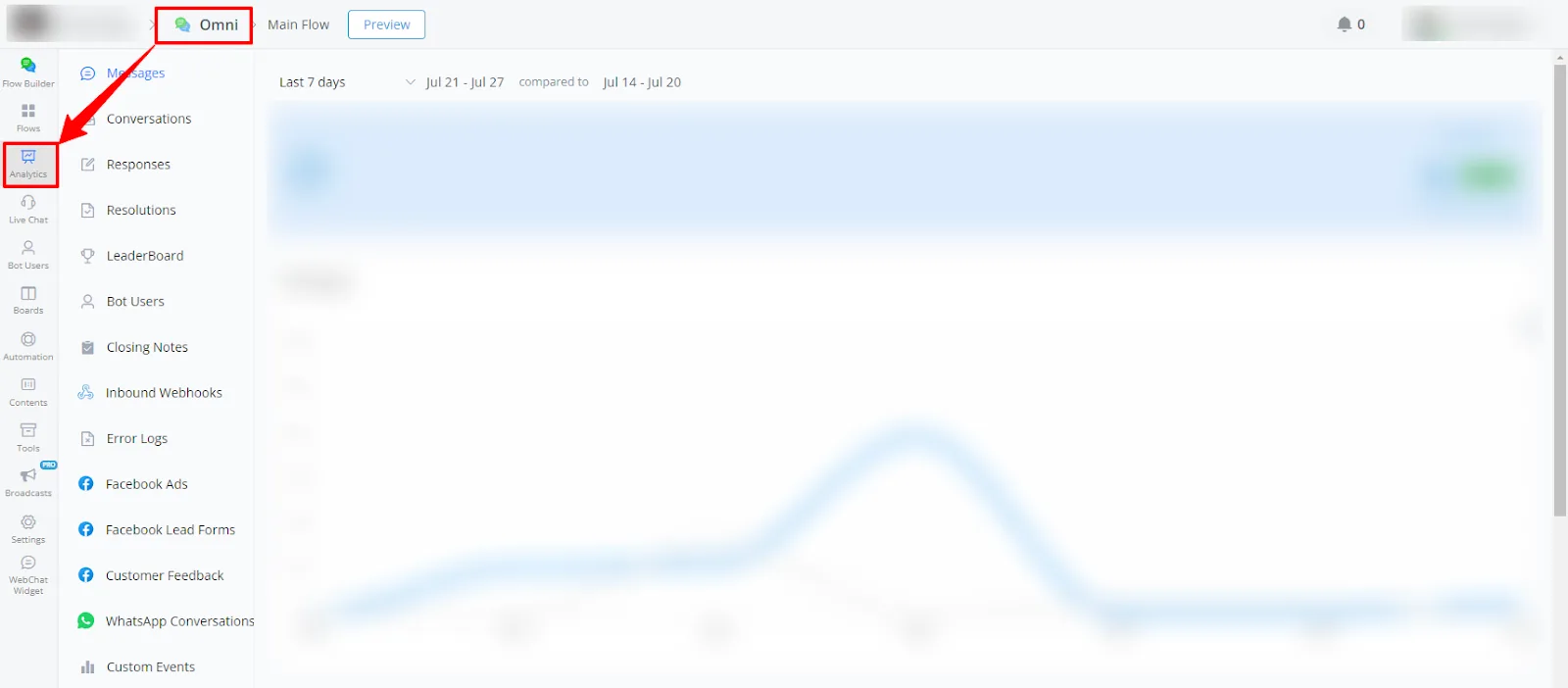
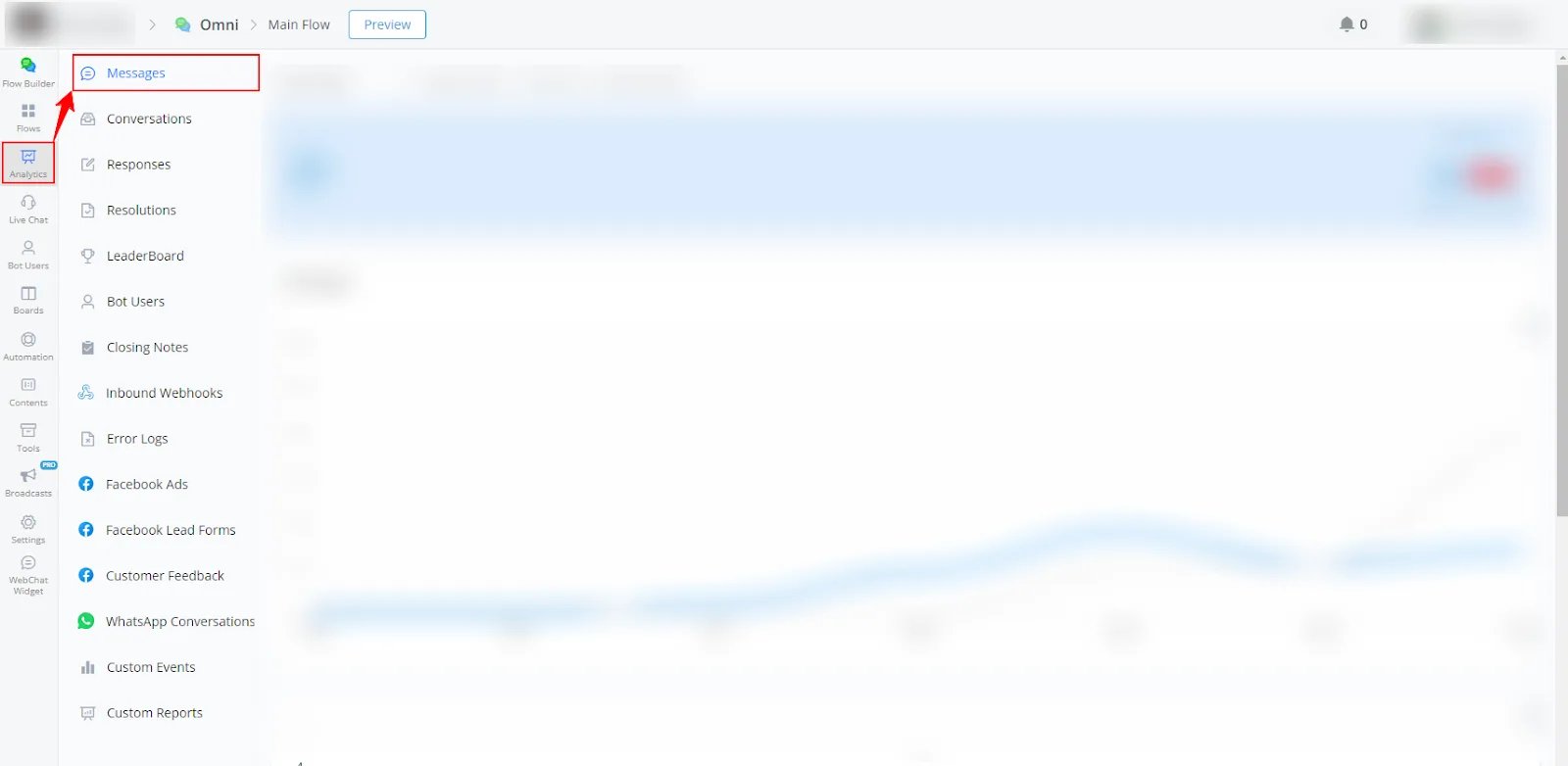
- Select Messages in the left-side menu.
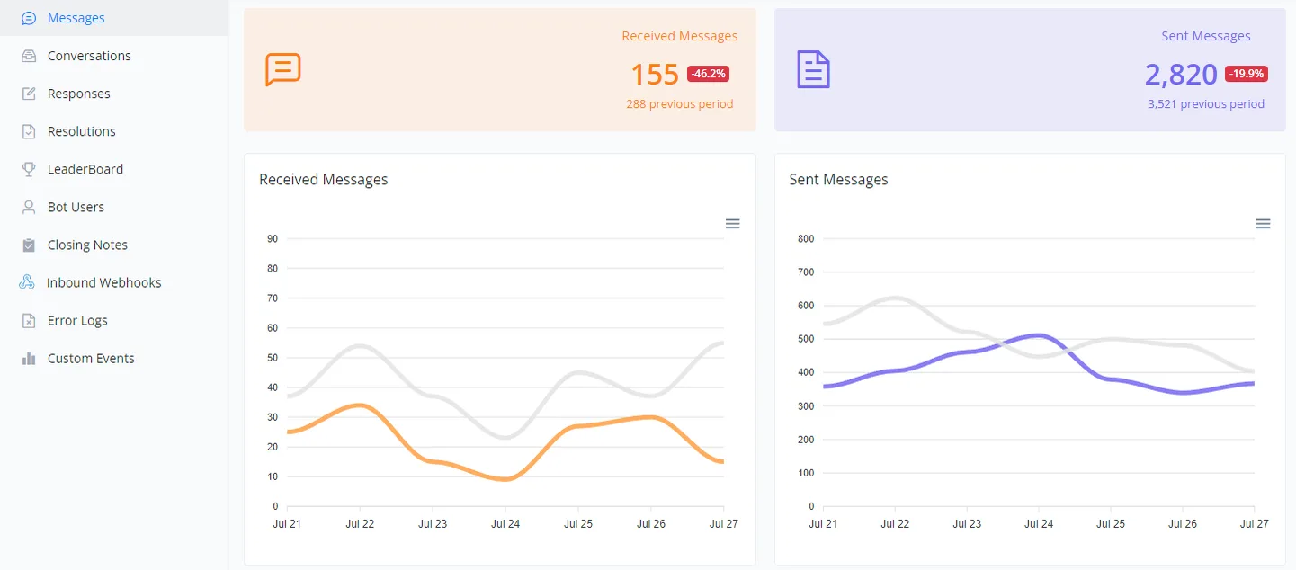
This section details the metrics of received and sent messages over a specific period. The charts help you visualize fluctuations in communication and compare them to previous periods.
- The orange line represents the messages received in the current period.
- The gray line represents the messages received in the previous period.
- The blue line represents the messages sent in the current period.
- The gray line represents the messages sent in the previous period.
- Volume analysis: helps you understand the volume of communication on different days, identifying patterns of high and low activity.
- Performance evaluation: assists in evaluating the effectiveness of responses and engagement with users.
- Period comparison: the comparative view between different periods helps identify trends and possible areas for improvement.
Below is a visual example of the charts:
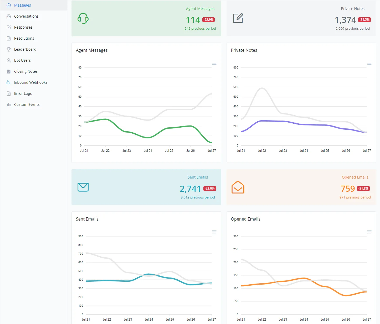
This section provides a detailed overview of agent messages, private notes and emails sent and opened during a specific period. The charts allow a clear comparison between the current and previous periods, helping you assess performance and identify trends.
- Line Chart:
The green line represents agent messages in the current period. The gray line represents agent messages in the previous period.
- Line Chart:
The blue line represents private notes in the current period. The gray line represents private notes in the previous period.
- Line Chart:
The light blue line represents emails sent in the current period. The gray line represents emails sent in the previous period.
- Line Chart:
The orange line represents emails opened in the current period. The gray line represents emails opened in the previous period.
- Performance evaluation: the charts help you understand the efficiency of agent communication and the use of private notes.
- Email analysis: lets you evaluate reach and engagement through emails sent and opened.
- Trend identification: comparing periods helps identify changes and make informed decisions.
Below is a visual example of the charts:
If you need further assistance, open a ticket at discord.com/channels/1147227963792830534/1153402986240946358