
Conversations (Statistics)
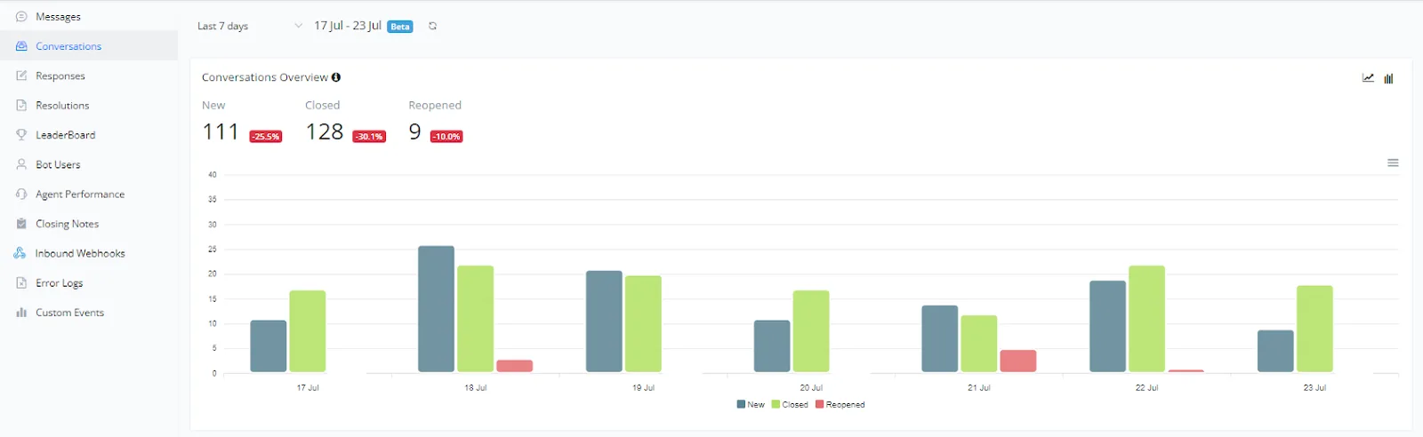
This section provides an overview of conversations over a specific period. The chart helps visualize the number of new, closed, and reopened conversations, making it easier to analyze customer support activity and efficiency.
This section provides an overview of conversations over a specific period. The chart helps visualize the number of new, closed, and reopened conversations, making it easier to analyze customer support activity and efficiency.
- New conversations: represented in blue, these are the conversations initiated by users during the period.
- Closed conversations: represented in green, these are the conversations that were closed during the period.
- Reopened conversations: represented in red, these are the conversations that were reopened after being closed.
- Support efficiency: by comparing the numbers of new, closed, and reopened conversations, you can evaluate the support team's efficiency and identify areas that need improvement.
- Identifying activity peaks: the chart shows the days with the highest and lowest activity, allowing adjustments in resource allocation to improve support during peak hours.
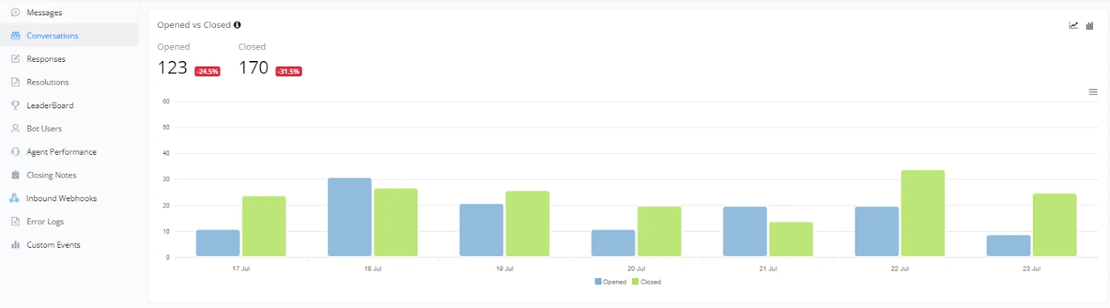
This section presents a comparison between the number of open and closed conversations over a specific period. The chart helps visualize customer support efficiency and identify possible bottlenecks or periods of high demand.
- Open conversations: represented in blue, these are the conversations initiated by users during the period.
- Closed conversations: represented in green, these are the conversations that were closed during the period.
- Support efficiency: by comparing the numbers of open and closed conversations, you can evaluate the support team's efficiency. Ideally, the number of closed conversations should be close to the number of open conversations.
- Identifying activity peaks: the chart shows the days with the highest and lowest activity, allowing adjustments in resource allocation to improve support during peak hours.
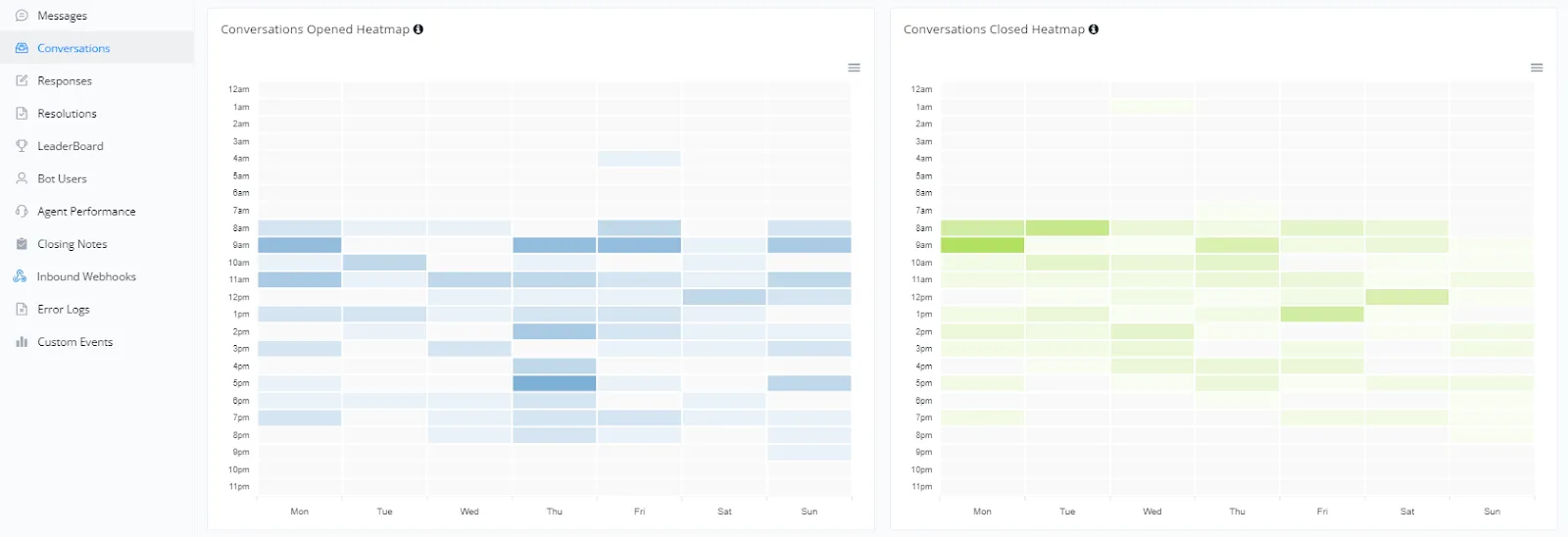
In this section, we present heatmaps with open and closed conversations throughout the week, segmented by hour of the day. These charts help identify activity patterns, allowing optimized resource allocation and support planning.
- The chart on the left shows open conversations by day of the week and hour of the day. Darker colors indicate periods of higher activity.
- This heatmap is useful for identifying when users are most likely to start conversations, allowing adjustments in the support team to cover peak hours.
- The chart on the right shows closed conversations by day of the week and hour of the day. Similar to the heatmap of open conversations, darker colors indicate higher activity.
- This chart helps you understand customer support efficiency and whether there are periods when conversations are closed more quickly.
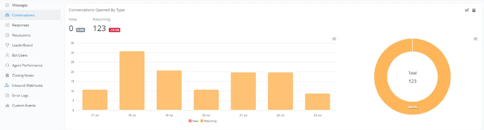
In this section, we present an analysis of open conversations categorized by type. This metric is essential for understanding the dynamics of interactions, distinguishing between new users and returning users.
- The bar chart shows the number of open conversations by new users and returning users over the days. This helps us monitor how different types of users are interacting with the system.
- The donut chart on the right presents the overall proportion of open conversations by new and returning users, offering a clear view of the distribution of interactions.
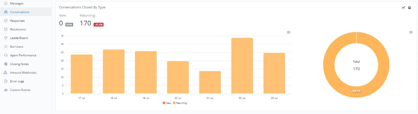
In this section, we present an analysis of closed conversations categorized by type. This metric is important for understanding customer behavior and support efficiency.
- The bar chart shows the number of new and returning conversations that were closed over the days. This helps us monitor how customers are interacting with support over time.
- The donut chart on the right presents the overall proportion between new and returning closed conversations, offering a clear view of the distribution of closed interactions.
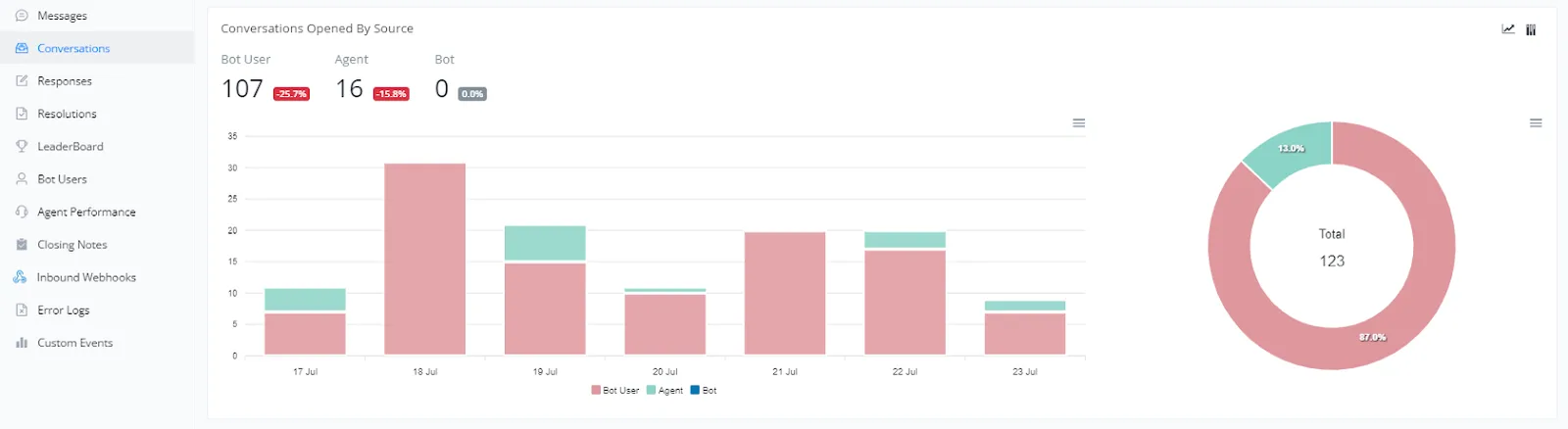
In this section, we present an analysis of open conversations categorized by source. This metric is essential for understanding the origin of interactions and evaluating the effectiveness of different support channels.
- The bar chart shows the number of open conversations by contacts, agents, and the bot itself over the days. This helps us monitor how different channels are being used over time.
- The donut chart on the right presents the overall proportion of open conversations by each source, offering a clear view of the distribution of initiated interactions.
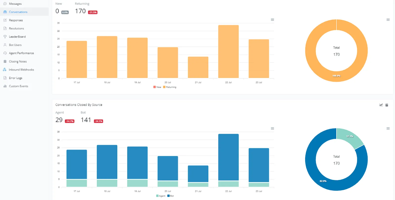
In this section, we provide an overview of the number of conversations and how they were closed, either by an agent or a bot. Analyzing these metrics can help us better understand customer interaction with our support system.
- The bar chart at the top shows the number of new and returning conversations over the days. It is important to track this metric to understand the flow of interactions and customer loyalty to the support system.
- The donut chart on the right presents the overall proportion of new conversations compared to returning ones, offering a clear view of the distribution.
- The second bar chart illustrates the number of conversations closed by agents and bots over time. Monitoring this information helps identify the efficiency of each source in closing cases.
- The donut chart on the right presents the overall proportion of conversations closed by agents and bots, providing an overview of each one's performance.